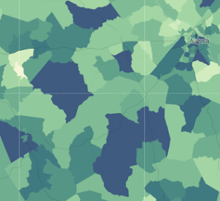
A greater percentage of men in Warren County have chosen to work than in parts of many surrounding counties — that's according to Census data made public by the New York Times.
The Times has taken an in-depth look at the phenomena of more and more men choosing not to work and the reasons for it: They include both the iffy economy as well as larger societal changes. (Keep in mind, this is different from unemployment, in which a person is capable of working and wants to work but cannot find a job.)
The Times' story comes with an interactive map showing the Census Bureau's estimates of the percentage of men in each Census tract in America who have chosen not to work.
Twenty-eight percent of men in Warren County's smaller Census tract — which includes much of Warrenton and reaches southeast to the Panhandle — have chosen not to work, according to the Census Bureau, while 18 percent of men in the county's larger Census tract have chosen not to work.
That works out to almost a third of the men in the smaller tract and nearly one out of every five in the larger tract.
(It bears pointing out that the margin for error of these very small, rural Census tracts is really substantial — plus or minus 12 percentage points for the larger tract, and plus or minus nine percentage points for the smaller tract.)
But the numbers are even more substantial for some of our neighboring counties:
• In McDuffie County, one Census tract has an estimated 47 percent of men who aren't working (margin of error, 11 points)
• In Wilkes County, one tract has an estimated 62 percent not working (margin of error, 11 points)
• In eastern Hancock County, 76 percent of men aren't working (margin of error, six points)
• In one tract in Washington County, 68 percent of men aren't working (margin of error, five points)
• In central Jefferson County, 55 percent of men aren't working (margin of error, nine points).
You can see the complete interactive map for yourself at this link. The data used in it came from the Census' American Community Survey estimates from 2009 to last year.

No comments:
Post a Comment